Amazon A+ Content is not just decoration under the product detail page. It is the part of the listing where a brand can slow the shopper down, answer the questions that usually create hesitation, and make the product feel easier to trust. A strong A+ Content strategy connects product benefits, brand positioning, comparison logic, and visual storytelling into one clean buying path.
The mistake many sellers make is treating A+ Content like a gallery. They add attractive images, a few lifestyle shots, and some generic claims, but the modules do not solve a real conversion problem. Good A+ Content begins with the buyer's doubts: Is this product right for me? Is it better than the other option? Will it fit my use case? Can I trust this brand?
Start With the Buyer Decision
Before designing any module, define what the shopper must believe before they can buy. For example, a leather care product may need to prove material safety, ease of use, before-and-after impact, and brand authority. A beauty tool may need to explain size, skin compatibility, hygiene, and routine fit. Each product has a different decision chain.
Write the decision chain before the design begins. This gives every module a job. One module might introduce the brand promise, one might explain the core benefit, one might compare product variants, and one might remove a common objection. When every module has a purpose, the page feels clear instead of crowded.
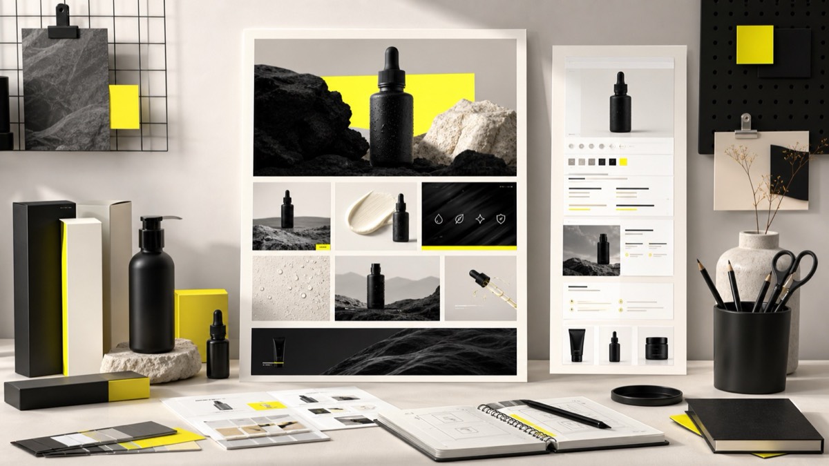
Use Modules Like a Sales Conversation
A+ Content should flow like a helpful product expert. Open with the strongest promise, support it with visual proof, explain important features, show the product in context, and end with a reason to choose the brand. This structure helps shoppers move from curiosity to confidence.
For most listings, a useful sequence includes a brand hero, feature highlights, lifestyle application, material or size clarity, comparison table, and a closing trust module. The exact order can change, but the logic should always be shopper-first. If a module does not answer a buying question, it should be simplified or removed.
Design for Mobile First
Many Amazon shoppers browse on mobile, so A+ Content must be readable at smaller sizes. Avoid long paragraphs inside graphics, tiny icons, weak contrast, and layouts that only make sense on desktop. Use short benefit statements, large product visuals, and clear spacing.
Mobile-first design also changes how you plan hierarchy. The shopper should understand each module in a few seconds. The main visual should carry the message, while copy supports it. If the module needs a long explanation to make sense, it is probably doing too much.
Match Keywords With Conversion Intent
A+ Content is not a replacement for title, bullets, and backend search terms, but the language still matters. Use words that match the buyer's search intent and product concerns. If shoppers care about durability, compatibility, natural ingredients, or premium finish, those themes should appear naturally in the page.
Do not force keywords into every sentence. A+ Content should feel like brand communication, not a keyword list. The best approach is to combine search understanding with visual proof so the page feels useful to humans and relevant to the product category.
Frequently Asked Questions
How many A+ Content modules should an Amazon listing use?
Use enough modules to explain the product clearly without repeating the same benefit. Most strong listings need a brand intro, feature highlights, lifestyle context, objection handling, and a comparison or trust module.
Does A+ Content directly improve Amazon keyword ranking?
A+ Content is mainly a conversion and trust asset, but stronger engagement and conversion can support listing performance. Keywords still belong in titles, bullets, backend terms, and relevant page copy.
What makes A+ Content convert better?
Clear hierarchy, benefit-led visuals, objection handling, proof points, readable copy, mobile-friendly modules, and consistent brand styling usually improve shopper confidence.
Conclusion
A+ Content converts when it has a strategy behind it. Start with buyer objections, organize modules like a sales conversation, design for mobile readability, and make every visual prove something useful. When the page explains value clearly, shoppers have fewer reasons to leave and more reasons to choose your brand.