On Amazon, your main product image is not one asset among many — it is the only thing a buyer sees before deciding whether to click. It appears in search results, sponsored ads, and category browse pages. Every fraction of a percentage point improvement in click-through rate (CTR) means more traffic from the same ad budget and the same organic ranking.
Yet most sellers underinvest in main image design. They use the manufacturer's stock photo, a casual product shot, or an image cropped incorrectly for the thumbnail frame. The result: lower CTR, higher cost per click, and slower organic growth — all from a single avoidable mistake.
What Amazon CTR Actually Measures
Click-through rate on Amazon is the percentage of shoppers who see your listing in search results and choose to click it. For organic listings it is tracked via unit session percentage; for sponsored ads it is reported directly. A higher CTR means your listing is more compelling at the moment of decision — before price, before reviews, before description.
At thumbnail size (roughly 200×200px on most search result pages), your main image is competing against dozens of other products. The buyer's eye moves fast. You have milliseconds to earn the click.
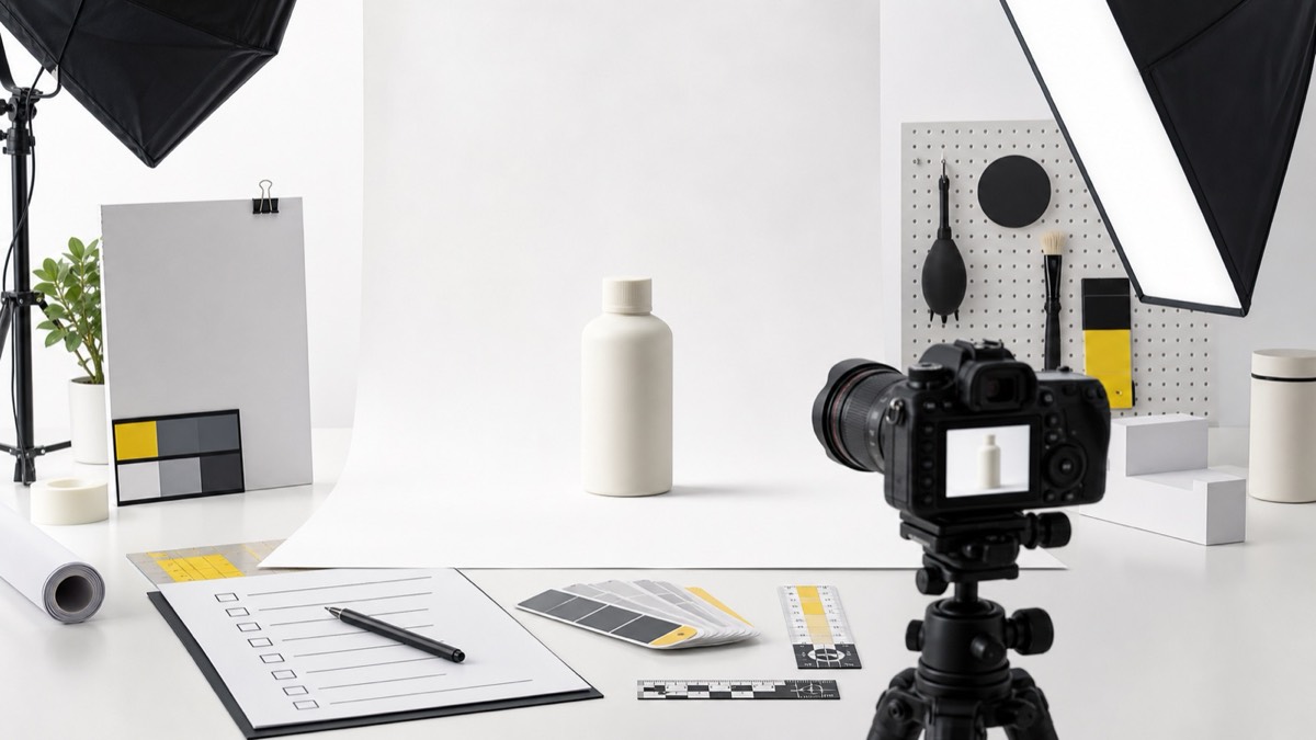
The 6 Design Decisions That Drive CTR
1. Product Fill Percentage
Amazon recommends the product occupies 85% or more of the image frame. Products that are too small look insignificant in thumbnails and lose to competitors whose products fill the space confidently. Zoom in. Fill the frame.
2. Background Purity
The main image requires a pure white background (RGB 255, 255, 255). Off-white, cream, or grey backgrounds look dirty in the thumbnail grid and signal low production quality. Use a true white.
3. Lighting Quality
Flat or inconsistent lighting kills product appeal. Professional lighting creates depth, highlights the product's best features, and signals premium quality before the buyer reads a single word. Studio-style even lighting with a subtle shadow grounds the product naturally.
4. Shape Clarity
At thumbnail size, the product silhouette must be immediately recognizable. Complex products should be positioned at the angle that best communicates what they are. If your product looks ambiguous at 200px, you lose the click to a clearer competitor.
5. Angle Selection
The front-facing angle is standard but not always optimal. For products where the packaging label is the key differentiator (supplements, cosmetics, food), a slight 3/4 angle can show both the front label and the product volume simultaneously — more information in the same thumbnail space.
6. Color Accuracy
If your product colour looks different in the thumbnail than it does in real life, you will face returns and negative reviews. Accurate color reproduction is both a CTR factor (buyers search for specific colors) and a trust factor (what they see is what they get).
The Hidden CTR Lever: Competitor Visual Differentiation
In any competitive category, most main images look similar. The fastest way to improve CTR is not to make a better version of what everyone else is doing — it is to look noticeably different while still being clear and compliant.
Before designing or redesigning your main image, screenshot your top 10 competitors' thumbnails at search-result size. You will immediately see patterns: similar angles, similar color palettes, similar amounts of negative space. Breaking these patterns — in a way that still communicates your product clearly — makes your listing stand out without gimmicks.
Testing and Measuring Image CTR Improvements
If you are enrolled in Amazon Brand Registry, use Manage Your Experiments to A/B test your main image against an alternative. Amazon will split traffic between the two versions and tell you which performs better with statistical significance.
Without Brand Registry, track unit session percentage in Seller Central before and after any image change. Allow at least 2–4 weeks of data before drawing conclusions — daily fluctuation can be misleading in shorter windows.
Summary: CTR-Optimised Image Checklist
- Pure white background (RGB 255, 255, 255)
- Product fills 85%+ of the frame
- Professional studio lighting with natural shadow
- Best-clarity angle for the product type
- Accurate color reproduction verified against physical product
- Minimum 1000×1000px (2000×2000px recommended) for zoom
- No text, logos, or watermarks on main image
- Thumbnail tested at 200×200px before finalizing
Your main image is your most important conversion asset. Treat it with the same attention you give your price, your title, and your reviews — because for the buyer arriving from search, it is the first and sometimes only thing that determines the click.