
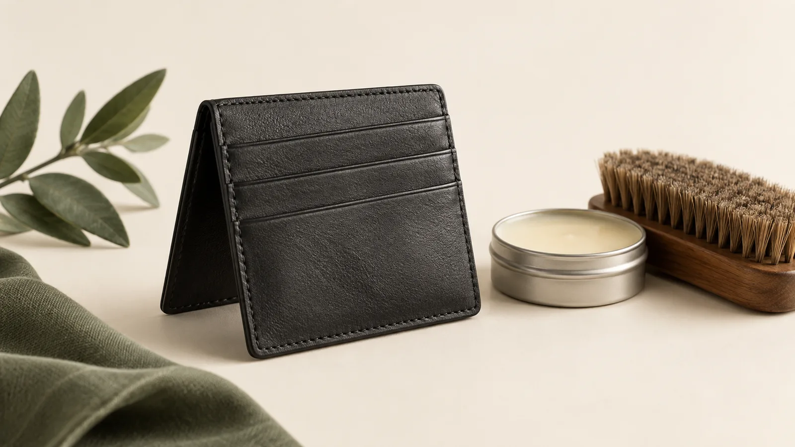
Most advice about Amazon main images is written for products that are easy to photograph — a bottle, a box, a gadget with hard edges and a bright color. Leather is none of those things. It is dark, it is soft, its entire value lives in a surface texture, and it is usually being sold to someone who cannot touch it. Every one of those qualities survives a studio shoot and then quietly collapses at thumbnail size. If your leather or shoe care listing gets impressions but not clicks, the problem is almost never that the photograph is bad. It is that the photograph was judged at full size and is being sold at the size of a postage stamp.
Black Leather Turns Into a Silhouette
A black leather wallet on a white background is, at thumbnail size, a black shape on a white field. The stitching that justifies the price, the edge paint, the slight roll of the fold — all of it compresses into one flat mass. The shopper does not see a well-made wallet. They see a dark blob, and their eye moves on to the listing next to yours where the product happens to be tan.
This is a lighting problem before it is a design problem. Flat frontal light is what kills a dark product: it removes the shadow that separates one plane from another, and without those separations the object has no readable form. What dark leather needs is raking light across the surface and a deliberate difference in brightness between the faces of the product, so that at any size the eye can still tell where the object turns a corner.
The test is not whether the image looks good on your monitor. Shrink it to the size of a fingernail and look again. If you cannot tell what shape the product is, neither can the shopper, and no amount of work further down the listing will recover a click that never happened.
Grain Is the Product, and Grain Is the First Thing to Disappear
When someone pays a premium for full-grain leather, they are paying for a visible surface — the pores, the pull-up, the way the finish sits in the hide rather than on top of it. That texture is fine, high-frequency detail, and fine detail is precisely what gets destroyed when an image is scaled down and recompressed for a search results grid.
So a listing can be technically compliant, high resolution, correctly lit, and still communicate nothing about quality, because the one attribute that justifies the price never survives the journey to the shopper’s screen. The result is a premium product that looks, in the grid, exactly like the cheap one.
The answer is not more resolution. It is composition. If grain is the argument, the grain has to occupy enough of the frame to still be legible after scaling — which usually means shooting closer than feels natural, and accepting that the main image shows the product large and slightly cropped rather than small and complete. Wholeness is what the side images are for.
Sheen Reads as Glare, Not as Quality
Conditioned leather has a low, soft sheen, and photographing it is a balancing act. Too little and the product looks dry and unloved, which is fatal for a care product whose entire promise is restoration. Too much and the highlight blows out into a white patch that reads as camera glare — cheap, plasticky, and on a dark product, distracting enough to be the only thing the eye lands on.
The failure mode specific to shoe care and leather care is worse than merely unattractive. A blown highlight on a conditioned surface actively undermines the claim being made, because it looks like a wet, greasy finish rather than a nourished one. You are selling the opposite of greasy.
- Broad, soft sources: large diffusion close to the product, so the highlight is a gradient rather than a hotspot.
- Highlight placement: put the sheen where it describes a curve, not where it sits as a floating white shape.
- Check the thumbnail: a highlight that reads as sheen at full size often reads as a blank patch when scaled down.
The Color You Photograph Is Not the Color They Receive
Leather browns are unusually difficult to reproduce. Tan, cognac, chestnut and mid-brown sit in a part of the color space where small shifts in white balance or saturation move the product a visible step along that range. A tan that renders slightly warm looks cognac. A brown pushed for richness on a bright monitor arrives, in the buyer’s hands, as something darker than they expected.
That gap does not just cost you a return. It costs you the review that mentions the color was wrong, which then sits under the listing influencing every buyer after it. For a category where color is the main variant a shopper chooses between, getting this right is worth more than any amount of styling.
Photograph a known reference in the same lighting setup, correct to it, and then check the result on a phone rather than the screen you edited on — because a phone is where the decision is actually made.
Everyone in the Category Shoots the Same Frame
Open a search results page for leather conditioner or shoe cream and look at the grid rather than any single listing. The products are broadly the same shape, photographed at broadly the same angle, on the same white background, in the same warm brown. Individually each image is fine. Collectively they are wallpaper, and a shopper scrolling past sees one repeated product rather than a set of choices.
Compliance requirements constrain the main image, and they should — the white background exists for a reason. But within those constraints there is far more room than most sellers use: the angle the product is presented at, how much of the frame it occupies, whether a multi-piece kit is arranged as a stack or a line, whether the cap is on or off. These are small decisions, and they are the only ones available at the top of the funnel.
The question worth asking about your main image is not whether it is good. It is whether it is distinguishable from the three listings that will appear beside it.
What to Fix First
These problems are not equally expensive to solve, and they do not cost you equally. Work in this order, because each one is a prerequisite for the next mattering at all.
- Shape legibility: if the product is unreadable at thumbnail size nothing else matters, because there is no click to improve.
- Differentiation: being visibly distinct from your neighbours in the grid is worth more than being marginally more beautiful than them.
- Texture: once you have the click, grain is what separates your price from the cheaper listing.
- Color accuracy: this protects margin rather than winning clicks, but a color complaint in your reviews follows you permanently.
Related Reading
- Amazon Product Image CTR Optimization
- Why the White Background Matters for Your Main Image
- Amazon Listing Audit: A Pre-Redesign Checklist
Frequently Asked Questions
Should a black leather product be photographed on a pure white background?
Yes, the main image still needs a clean white background. The fix for a dark product is not a different background but different lighting — raking light and deliberate tonal separation between the faces of the product, so the shape stays readable when the image is scaled down to thumbnail size.
Why does my leather product look cheap in Amazon search results but fine on my own site?
Your site displays the image large, where grain and stitching are visible. The search grid displays it small and recompressed, which destroys exactly that fine detail. A main image composed for a large display often communicates nothing at the size where the click is actually decided.
How do I check whether my main image works at thumbnail size?
Search your main keyword on a phone and find your product in the grid alongside its real competitors. Judging the image alone at full size tells you almost nothing, because that is not the context in which a shopper ever compares it.
Is a lifestyle image better than a plain product shot for leather goods?
Not for the main image, which needs to stay compliant and instantly readable. Context belongs in the side images, where a leather product shown in use does work that a white-background shot cannot — particularly for care products, where the transformation is the entire proposition.
Conclusion
Leather punishes the assumptions that make product photography straightforward everywhere else. It is dark where the grid rewards contrast, detailed where compression removes detail, and sold on a surface quality that a small image is barely capable of carrying. None of that is fixed by a better camera. It is fixed by composing for the size the image is actually judged at, and by treating the search results grid — not the product page — as the place your main image has to win.