
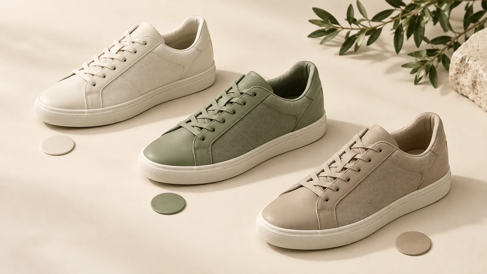
Almost every guide to Amazon footwear images is really a guide to the main image. That is the one that fights for the click in search results, so it gets the attention. But a shopper who lands on a boot listing with five colourways does not then look at your main image again. They look at a row of small square swatches under the buy box, and they pick one. Whatever they pick is the shoe they judge you on. If that row is confusing, the click you paid for lands on the wrong colour and the shopper leaves believing your boot looks worse than it does.
The swatch is a decision, not a decoration
Treat the swatch row as a second search result page that only your product is competing in. The shopper has already chosen you. All that is left is choosing which version of you, and they will make that choice from images small enough that shape and colour are the only information that survives.
That framing changes what a good swatch is. It is not a shrunken hero shot. It is the smallest image that still answers one question: is this the colour I want? Everything that does not serve that question — the sole, the branding, the background, the artful angle — is competing for pixels with the only thing the shopper is trying to read.
- One question per swatch.: Colour. Not material story, not lifestyle, not the tread pattern. Those belong further down the image set, where they have room to be seen.
- Readable at thumbnail size.: Before you upload, shrink the swatch on your own screen until it is the size Amazon will render it. If you cannot name the colour at that size, neither can a shopper.
- Consistent framing across the family.: The eye compares swatches to each other, not to an ideal. Inconsistency reads as a different product, not a different colour.
WHAT THE SHOPPER ACTUALLY SEES
Why a cropped hero makes a bad swatch
The common shortcut is to crop the main image down and use that. It saves a shoot and it looks fine on a desktop monitor at full size. It fails at the size that matters, because a main image is composed to fill the frame with the whole shoe — and when you shrink that composition to a square the size of a fingernail, the dominant thing in it is often the sole, the shadow, or the negative space around the toe.
A shopper scanning the row is not reading shapes. They are reading a colour field. If half of your swatch is white background and a third of the rest is a dark outsole, the actual upper colour is a sliver, and two similar colourways become impossible to tell apart. The shopper picks one at random or gives up on the decision entirely, which for a considered purchase like footwear usually means leaving.
The fix is not clever. Shoot or crop the swatch so the upper — the part whose colour is being chosen — fills most of the square, at the same angle for every variation in the family.
SAME SHOE, TWO CROPS
Keep the angle identical across every colourway
This is the failure that costs the most and gets noticed the least, because each image looks perfectly good on its own. One colourway was shot at a three-quarter angle, another straight from the side, a third at a slight tilt because it was reshot months later by someone else. Individually, all fine. In a row, they read as different products.
When the angles disagree, the shopper stops comparing colour and starts trying to work out whether these are even the same shoe. That hesitation is the whole cost. A listing that makes someone think before they can choose has already spent the goodwill it earned with the main image.
If your colourways were photographed at different times, the honest fix is to reshoot the set together rather than to correct them individually. Matching an angle after the fact rarely survives being placed next to the original.
ONE FAMILY, FOUR SHOOTS
The size image is doing work the size chart cannot
Footwear returns are dominated by fit, and fit is the one thing your images cannot state as a fact. What images can do is set an expectation the size chart cannot: how the shoe sits on a foot, where the toe box actually ends, how high the shaft comes up an ankle.
A size chart is a table. A shopper reads it if they are already fairly convinced. Long before that, they are forming an impression of fit from your images, and if the images imply a slim, low-cut profile while the chart says the shoe runs wide, the shopper trusts the picture. They order, it does not match, and the return is booked against your listing.
So use one slot in the set to answer fit visually and honestly. On foot, at eye level, with nothing about the pose flattering the shape in a way the shoe does not deliver. This is the rare place where a less appealing image earns more than a beautiful one, because every return you avoid is a sale you keep.
WHERE FIT BELONGS IN THE SET
- 01MAIN IMAGEWins the click in search
- 02ON FOOTSets the fit expectation honestly
- 03DETAILMaterial, stitching, finish
- 04SCALEShaft height, toe box, profile
What Amazon’s own shoe guidance actually asks for
Amazon publishes a category style guide for shoes, and it is worth reading rather than relying on summaries of it. The rules it sets are the floor — pure white main image backgrounds, the product filling the frame, no props or text on the main image — and they are enforced by systems that do not care how good your photography is.
The part sellers most often miss is that the variation family is treated as a unit. Each child in the family carries its own images, and a family where one child is missing a swatch or carries a mismatched set is a family where Amazon may show a shopper something you did not intend.
Read the guide, then check your live listing on a phone rather than in Seller Central. Seller Central shows you a tidy grid of everything you uploaded. A shopper sees a small row on a screen held at arm’s length, and that is the only view that decides anything.
THE FLOOR, NOT THE TARGET
Related Reading
- Amazon Image Requirements 2026: The Complete Technical Specs Guide
- Why Amazon Rejects Product Images: Common Compliance Mistakes
- Mobile-First Amazon Listing Design
Frequently Asked Questions
Can I just crop my main image to make a variation swatch?
You can, and many sellers do, but it usually reads badly. A main image is composed to fill the frame with the whole shoe, so when it is shrunk to swatch size the dominant colour is often the background or the outsole rather than the upper. Crop tighter on the part whose colour is actually being chosen.
Do all colourways in a footwear family need the same photography angle?
Yes, and it matters more than it sounds. Shoppers compare swatches against each other, not against an ideal. When angles disagree the row reads as different products, and the shopper hesitates instead of choosing. If the colourways were shot at different times, reshooting the whole family together is usually more reliable than correcting them one by one.
Where should the fit image go in a footwear image set?
Early enough that a shopper sees it before they decide, which in practice means among the first few after the main image. Fit is the main driver of footwear returns, and a size chart only gets read by someone who is already fairly convinced. An honest on-foot image sets the expectation the chart cannot.
Does Amazon publish specific image rules for shoes?
It publishes a category style guide for shoes covering main image requirements and how variation families are expected to be built. It is worth reading in full rather than relying on summaries, because the requirements are enforced automatically and a family with a missing or mismatched child can be shown to shoppers in ways you did not intend.
Conclusion
None of this requires a bigger budget. It requires deciding that the swatch is part of the listing rather than an afterthought generated from the hero shot, and then shooting the family together so the row reads as one product in several colours. The main image earns you the visit. The swatch decides which shoe the visitor ever sees — and on a footwear listing with several colourways, that is the image quietly doing the most work.