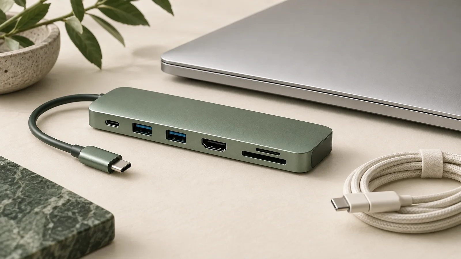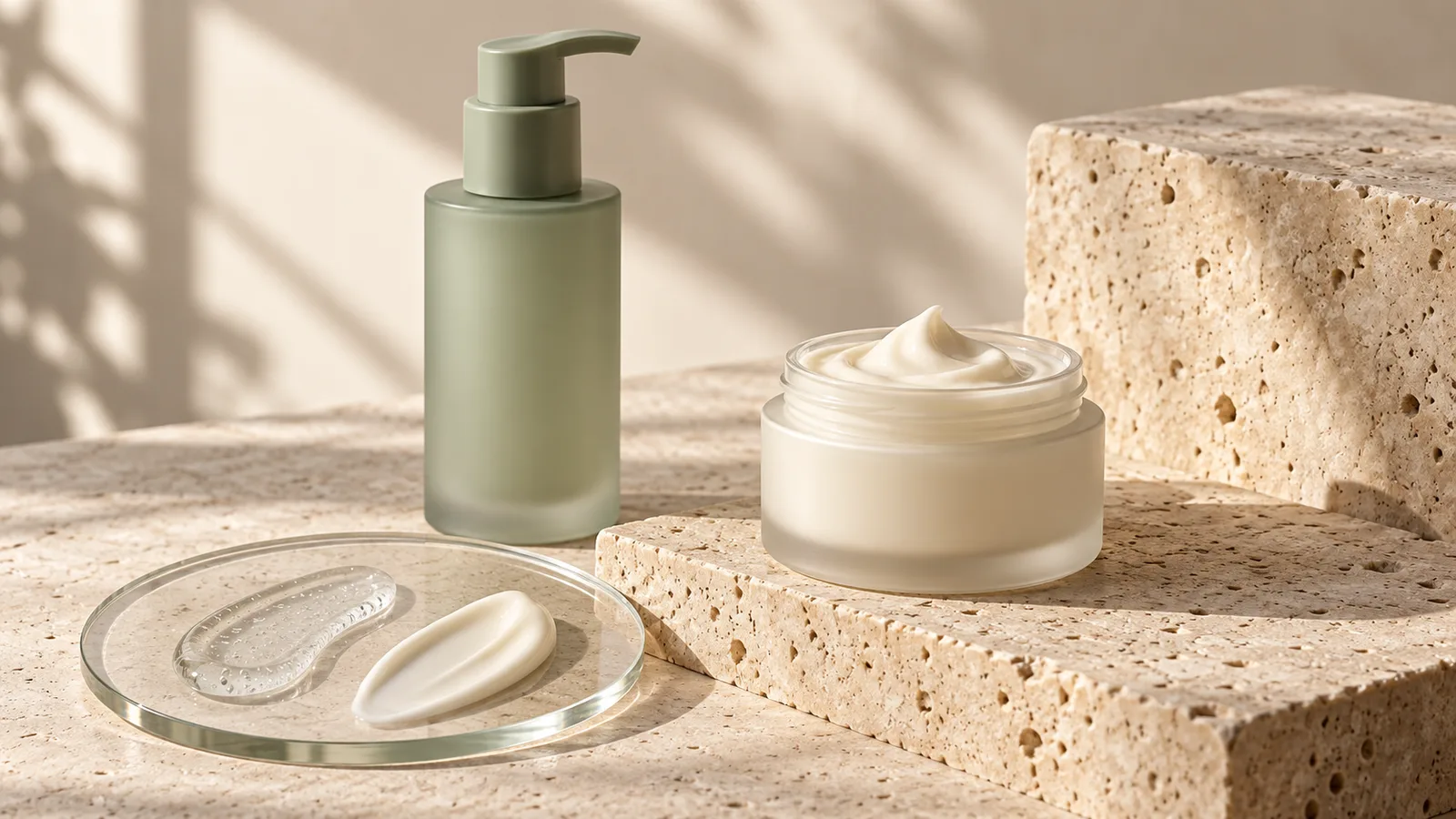
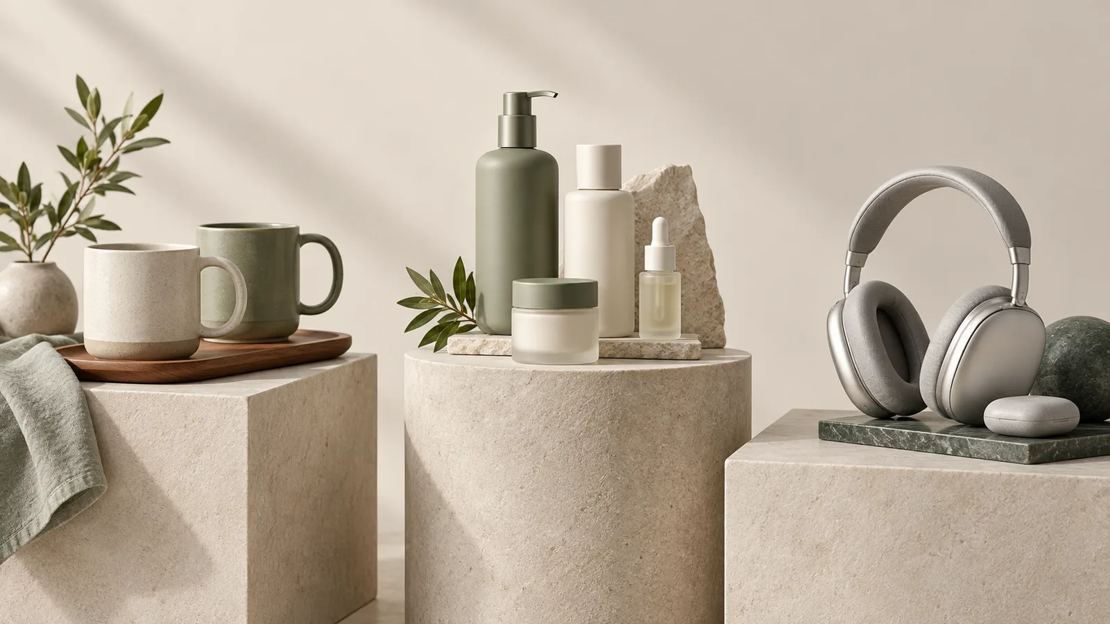
A brand can sell kitchen storage, bathroom accessories, and travel organizers without presenting them as an unrelated pile of products. The problem is deciding how a shopper should move through the range. A multi-category Amazon Brand Store needs recognizable entry points and consistent visual treatment, while each category still answers its own buying questions. Plan that structure before designing a large homepage banner.
Choose a navigation logic that matches the buying decision
Start by listing the product families and the words customers use to distinguish them. Consider whether they shop by room, product type, activity, or need. Amazon’s Brand Store guidance recommends simple, customer-focused organization. Your job is to choose the organizing principle that makes sense for this catalog, rather than use every possible grouping at the same level.
For example, a home range might use room-based entry points when the same organizing need appears in different spaces. A specialized electronics range may need product or device-family navigation instead. Treat these as design hypotheses to check against the actual products and customer questions. Internal warehouse categories and SKU prefixes rarely provide a helpful starting point for a shopper who has never seen the brand.
Give the homepage a routing job
The top of the store should establish what the brand offers and make the main paths visible. Use category imagery that clearly represents the products behind each destination. A broad lifestyle banner can set the mood, but a visitor should not have to interpret a mood photograph to discover whether the store sells the item they need.
Keep category names short and distinct, and avoid multiple labels that lead to almost the same selection. If an item belongs naturally in more than one shopping path, provide useful cross-links instead of duplicating an entire page without a reason. Draw the page map as a simple hierarchy and test whether a visitor can choose a destination from the labels alone.
DESIGN DECISION
- 01OrientShow the product families.
- 02ChooseRoute shoppers by a useful shopping decision.
- 03CompareUse product detail and comparison pages.
Let category pages explain their own selection
A category page should help the visitor make the next choice within that family. A kitchen storage page may organize by location or dimensions. A personal care range may need format distinctions. A technology accessories page may need verified compatibility information. Consistent typography and spacing can hold the store together without forcing every category into the same explanation.
Select imagery for the question being answered. A group photograph can introduce a collection, while product tiles help a shopper inspect individual options. Avoid sending every category link back to a broad mixed-product page. If advertising leads directly to a category, that page should orient a visitor who has not seen the homepage, including what the range is and where its products lead.
Use a shared visual system without hiding differences
Choose a common palette, a restrained type hierarchy, and repeatable spacing before producing the banners. Then allow each category to use the photographic angle and supporting information it needs. A reflective bottle and a textile organizer require different lighting choices. Consistency comes from recognizable art direction, not from treating different materials as though they are identical.
Build the image brief around the crops used in the actual Store Builder placements. Important product features should survive the mobile layout as well as the desktop view. Amazon publishes creative guidelines for store assets, so check the current placement requirements before export. Preview the assembled page in the builder rather than approving a collection of independent image files.
Check the path from arrival to product detail
Walk through the store using concrete shopping tasks. Find a particular product family, compare relevant alternatives, and open the intended detail page. Check that tiles point to the correct destinations and that navigation labels remain meaningful after entering a category. Repeat the exercise on mobile, where a long title or dense banner can be harder to interpret.
After publishing, use the store’s available reporting to identify pages worth investigating, while avoiding conclusions based on a single metric in isolation. A weak path might reflect confusing navigation, an irrelevant destination, or the audience arriving from an advertisement. Keep a record of structural changes so future reviews can connect observations to what changed. The store map should evolve with the catalog rather than accumulate a new page every time a product launches.
Related Reading
Official references
The recommendations above are design guidance. Check the current Amazon guidance for the marketplace and category before uploading.
Frequently Asked Questions
Should every product category get its own Brand Store page?
Create a page when it supports a distinct shopping decision and has enough relevant products or information to justify the destination. Avoid thin pages that simply repeat the homepage.
Can one design system work across unrelated product materials?
Yes. Use shared typography, spacing and brand direction while adapting photography and explanations to each product category.
What should I prepare before commissioning a multi-category store?
Provide the catalog, proposed product groupings, brand assets, buyer questions, and intended landing pages for advertising. A clear page map helps define the scope before banner design begins.
Conclusion
A multi-category Brand Store works when a visitor can recognize the range, choose a meaningful path, and compare relevant products. Build the navigation around those decisions, then use a coordinated visual system to make the journey feel like one brand.