A glossy skincare bottle says little about what comes out of it. A buyer comparing a gel with a cream wants to understand the texture, the dispenser, and how the product fits into an existing routine. Those questions need different visual evidence. Start your skincare image brief with the physical product and the approved information behind it, then decide which questions belong in the gallery and which deserve more space in A+ Content.
Separate what a photograph shows from what copy promises
A close-up can show a translucent gel, a dense cream, or the shape of a dispensing tip. It cannot establish how a formula will perform on every person. Keep that distinction visible in the brief. Describe observable product qualities using photographs of the real material; route benefit and ingredient statements to the brand owner for substantiation and approval before placing them in an image.
This matters even when the wording sounds familiar. Terms that imply a measured effect, a certification, or suitability for a specific concern need a basis beyond an attractive layout. A designer should not infer a claim from an ingredient list or make the claim stronger to fit a headline. Collect the approved wording alongside its owner so revisions do not slowly turn a limited statement into a broad promise.
Photograph the formula as carefully as the bottle
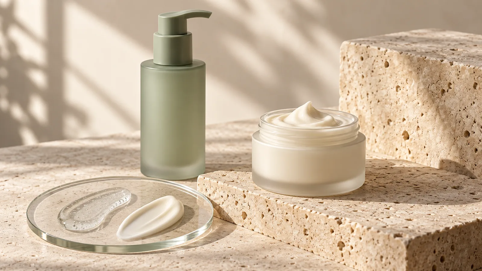
Plan a separate texture shot using the actual formula. Choose a clean surface and lighting that reveals its body without making it appear more translucent or richer than it is. Keep color grading consistent with the reference sample. Retouch dust and distractions carefully, but preserve the characteristics the photograph is meant to explain.
A dispenser detail can answer another practical question: does the product use a pump, a dropper, or an open jar? Show the real mechanism and cap. If the image demonstrates the amount released, confirm that the quantity is representative and avoid implying a usage instruction the brand has not approved. Treat texture and dispensing as separate information when combining them would make the panel crowded.
DESIGN DECISION
- 01IdentifyShow the exact bottle and label.
- 02ExplainPhotograph the real texture and dispenser.
- 03SupportUse approved product facts in the copy.
Build a routine panel from approved instructions
A routine graphic helps only if it reflects the actual directions. Ask the brand to supply the order of application and any relevant limitations exactly as they appear in its approved materials. The design task is to make that information easier to follow. It is not to create a skincare regimen or add medical advice to make the panel seem authoritative.
Use a simple sequence with a recognizable product view at the relevant step. Keep supporting text readable on a phone, and avoid embedding a long block of instructions into a tiny image. Where the chosen A+ module supports text, use it for the explanation so the image can focus on the product and the action. Check the final module preview rather than assuming the desktop composition will transfer unchanged.
Let packaging information support the choice
Buyers may need to distinguish a travel format from a full-size container or a refill from the original package. Show the actual selling unit and keep quantity wording consistent across the title, gallery, and packaging. A styling prop should not look like an extra item in the purchase. When several products appear in a routine image, make their role clear in the supporting explanation.
Preserve important label details during retouching. A replacement label built from an old packaging file can make a current product look outdated or inaccurate. Before finishing the images, compare the artwork version, container shape, and lid against the supplied sample. If the packaging is changing, agree which version customers will receive and which image set belongs to that version.
Use A+ Content to answer the next question
The gallery introduces the product. A+ Content can give a shopper more room to compare formats, understand a range, or read the brand’s product approach. Amazon describes A+ Content as a way to add enhanced images and text to product detail pages. Check the modules and eligibility available in your account before commissioning a layout that depends on a particular feature.
Choose the module order from buyer questions instead of repeating the same bottle photograph throughout the page. For example, a texture explanation can lead into a format comparison, followed by a clear introduction to related products. Use verified distinctions for comparisons and keep unsupported superiority claims out of the table. A coordinated visual style should help a reader recognize the range while still understanding what makes each item different.
Related Reading
Official references
The recommendations above are design guidance. Check the current Amazon guidance for the marketplace and category before uploading.
Frequently Asked Questions
Can AI generate the texture image for my actual skincare product?
Use the real formula when the image is intended to show its physical texture. An AI illustration can explore a visual direction, but it should not substitute for evidence of the product’s appearance.
Should every ingredient become an infographic callout?
Prioritize information that helps the buyer understand the specific product. Any benefit statement should come from approved, substantiated brand material.
What should a skincare A+ Content brief include?
Provide current packaging artwork, product photographs, approved wording, directions, and the differences between variants. Confirm which A+ modules are available in the account before layout begins.
Conclusion
Skincare imagery becomes more useful when it separates observable texture, practical packaging details, and approved product information. That gives a designer a clear job for each panel and gives shoppers a more grounded view of what they are choosing.