A drawer organizer can look perfect in a styled kitchen and still leave a shopper unable to decide whether it fits at home. The missing information is usually not another lifestyle photograph. It is the relationship between the product, the space it occupies, and the things it holds. For kitchen storage, design the gallery around those decisions before choosing backgrounds or decorative callouts. The same approach works for countertop appliances, food containers, dish racks, and cabinet accessories.
Start with the measurement that can rule out the purchase
Write down the first reason a buyer might discover the product is unsuitable. A drawer tray may clear the opening but catch underneath the drawer above it. A countertop organizer may fit beside a sink while leaving no room for a faucet handle. A food container may fit a shelf but not stand upright with its lid attached. These are different design problems, and a generic length-width-height graphic does not resolve all of them.
Ask the product owner which dimensions apply to the assembled product, which change during use, and which describe packaging. Keep those records separate. Your design brief should identify the actual variant being photographed and name the source of each measurement. Do not estimate dimensions from a supplier photograph or copy them from a visually similar competitor. A convincing diagram with the wrong measurement is harder for a shopper to question than a visibly incomplete one.
Separate external size from usable space
A useful dimensions panel establishes the overall footprint first. A second view can explain the inside compartment, opening, or clearance that matters. Use a straight-on or overhead view when perspective would make the endpoints ambiguous. Place dimension arrows against the specific edges being measured, and keep the labels away from handles, shadows, and textured backgrounds.
For an expandable organizer, show its contracted and expanded states as distinct arrangements. For a lidded container, make clear whether the stated height includes the lid. Capacity is another question: a volume claim is not a promise that every dry ingredient will weigh the same. Let approved product specifications control the wording. The infographic should explain a measurement, rather than create a new interpretation of it.
DESIGN DECISION
- 01Measure the spaceUse the narrowest usable opening.
- 02Check the productSeparate outside size from usable capacity.
- 03Show the fitMatch the diagram to the exact variant.
Use lifestyle photography to demonstrate a specific fit
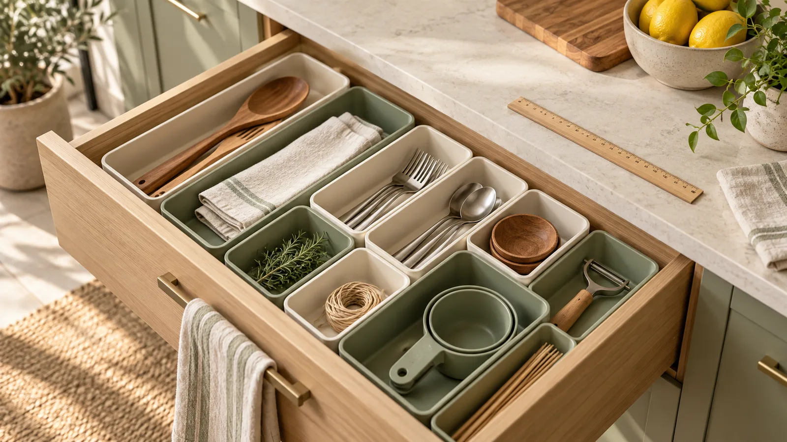
Once the dimensions are clear, choose a lifestyle scene that demonstrates the intended setting. A dish rack beside a real sink can show where water drains. A drawer insert photographed from above can show the relationship between the compartments and everyday utensils. Keep the product large enough to recognize; an attractive wide kitchen scene often makes the actual item a minor prop.
Scale references need care. An unusually large mug or shallow drawer can change the apparent size of the product. Use a representative setup and preserve its proportions during retouching. If a scene is composited, compare the product against a measured reference before approving it. Illustrative AI scenes can help plan art direction, but they should not become the evidence for whether a physical product fits.
Assign a different buying question to each image
Keep the main image focused on identifying the item and follow the requirements for its Amazon category. Use supporting images for the assembled dimensions, the usable interior, what is included, the product in use, and any care or installation information the owner has verified. This is a planning sequence, not a fixed number of image slots that every listing must use.
Look for duplication before booking another photograph. A second overhead beauty shot may add less information than a close-up showing how a divider is removed. If assembly needs explanation, a short sequence is often clearer than a dense paragraph beside the finished item. The sequence should show the real parts and their relationship, without implying that tools or accessories are included when they are not.
Approve the gallery against the physical sample
Review every measurement against the sample or the approved technical sheet. Check the selected color and size, the included pieces, and any removable components. Read the labels at a phone-sized preview rather than only on a large design monitor. If a line becomes unreadable, simplify the question the panel answers before enlarging every element and crowding the layout.
Finally, ask someone unfamiliar with the product to describe where it fits and what arrives in the box. If their answer depends on a guess, identify the image that should have answered it. Give your designer that missing question along with corrected source information. This produces a more useful revision brief than asking for the gallery to feel more premium.
Related Reading
Official references
The recommendations above are design guidance. Check the current Amazon guidance for the marketplace and category before uploading.
Frequently Asked Questions
Should kitchen product dimensions appear in the main image?
Plan explanatory measurements for supporting images and check the current category rules for the main image. Keep the main image focused on an accurate view of the product being sold.
Can a lifestyle photo replace a dimensions infographic?
It can show context, but perspective and props are unreliable measurement references. Use verified dimensions when fit is central to the purchase.
What should I send a designer for a kitchen listing?
Send the exact variant, approved measurements, included-item list, product photos, and the main fit questions buyers ask. Include an assembled sample or technical drawing when clearance is difficult to explain.
Conclusion
A useful kitchen gallery makes the practical purchase decision easier: the shopper can identify the item, check its fit, and understand what it holds. Build those answers from verified product information, then use photography and restrained graphics to make the relationships visible.